Marketers say that one of the most important marketing tools is a good logo design. It not only provides an easy to recognise identity for your business but also communicates who you are. That’s why every company considering having a new corporate identity developed should know the criteria that makes for an effective logo.
The first feature of a good and effective logo is that it can immediately “grab” viewer’s attention. Your logo should have an immediate impact and hold the viewer’s attention. A good logo is immediately associated with your company, by name or shape (Nike and Apple do this so well). Potential customers, or the public in general should never have to ‘second guess’ what you are trying to convey. Nor should they be reading anything other than who you are when they see your fantastic piece of branding artistry!
Here’s a few classic examples of companies not taking a wider view of their branding and becoming the butt of many, many jokes!
A-Style Logo
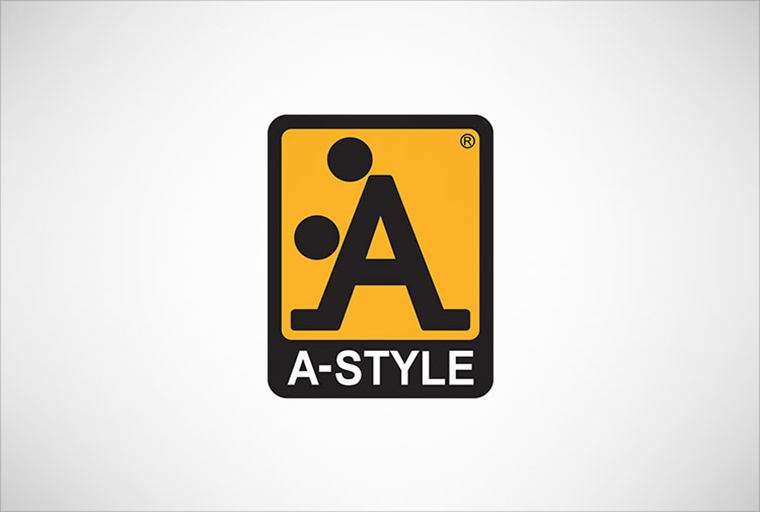
A-Style logo was born well before the line of clothing – designed in 1989 and marketed in Italy since 1999. It was in fact an invention of his creator who began to attack Italian cities with stickers on a yellow background with A-Style logo (an example of guerilla marketing), followed by other cities including Miami, Moscow and London. The newspapers and television began to be interested in the strange appearances of the logo, and soon the company started marketing their products under the brand A-Style. What style is that again?.
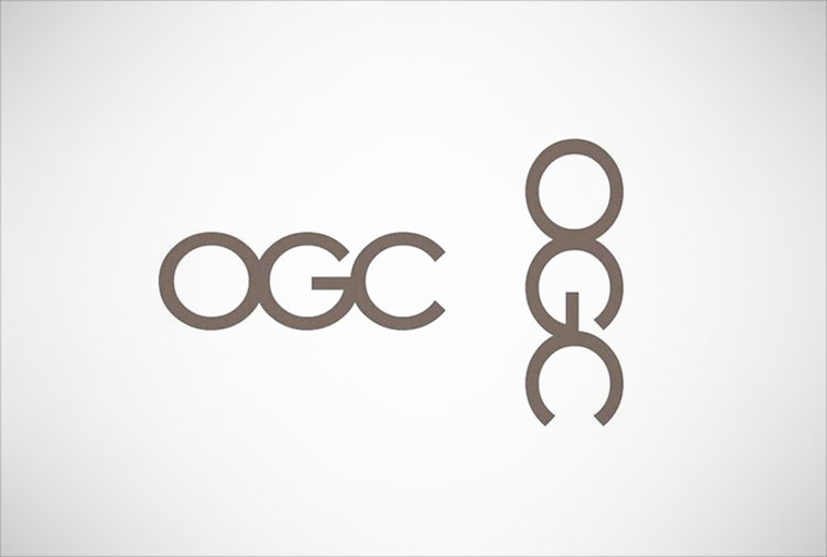
Office of Government Commerce
The Office of Government Commerce (OGC) is an independent Office of the Treasury. Sometimes you need to shift your view to realize a potential error.
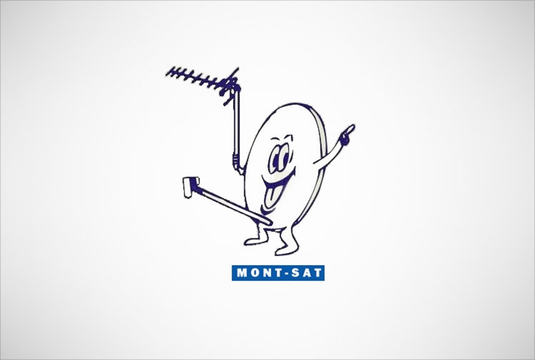
Mont-Sat
Mont-Sat… home of the very happy satellite dish.
Arlington Pediatric Center
They probably had the best of intentions when they were designing this one.
Catholic Church’s Archdiocesan Youth Commission
This is an actual logo designed in 1973 for the Catholic Church’s Archdiocesan Youth Commission. It even won an award from the Art Directors Club of Los Angeles. Good use of negative space, but questionable choice of an image.
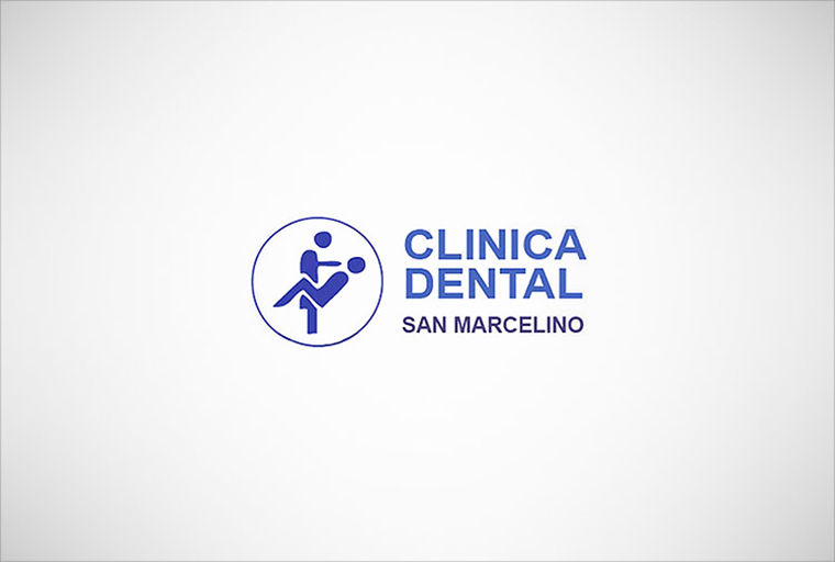
Clinica Dental
Yes, we see it too.
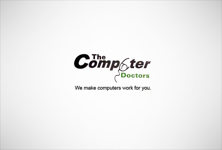
Computer Doctors
We are not sure if it’s meant to be a mouse or a stethoscope? We are sure it’s very, very wrong.
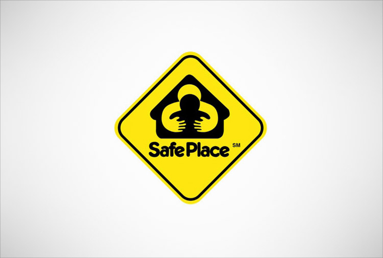
Safe Place
This logo is supposed to make you feel safe and secure, but with poor use of negative space it can give an incredibly negative image for the brand.
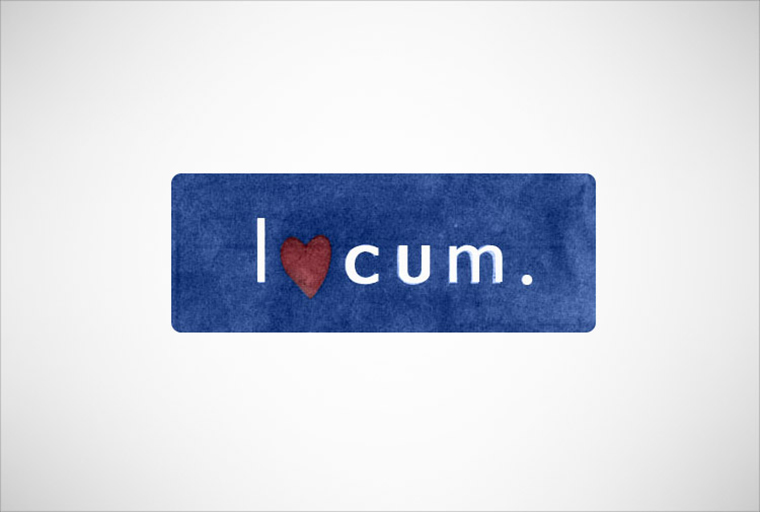
Locum
A logo for Locum, a Swedish property management company. How did they not see that?
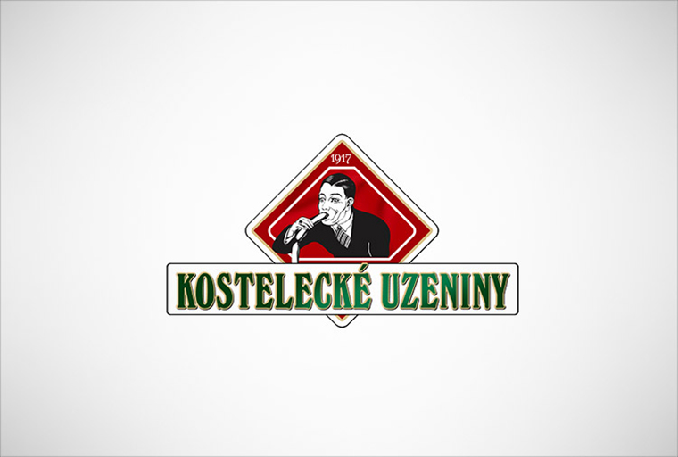
Kostelecké Luzeniny
Sometimes, demonstrating what to do with the product can be open to misinterpretation.
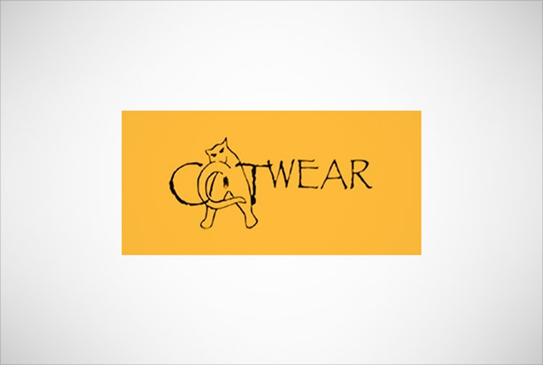
CatWear
We’re not sure if they’re using a lowercase “a” or an uppercase “A”. Either way it’s not something that adds value to the brand.
Rising Sun Sushi
Ok, you tell us what it is?
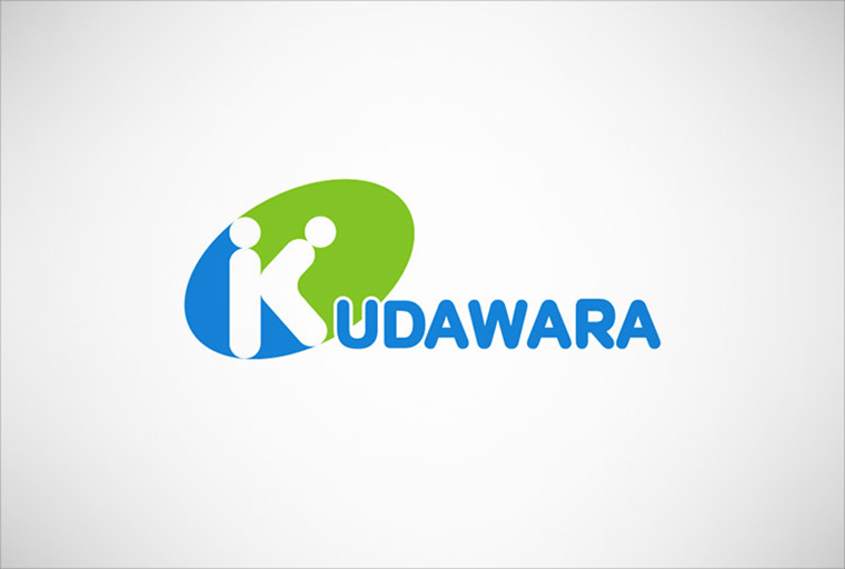
Kudawara Pharmacy
The designers for the A-Style logo may have had a hand in this.
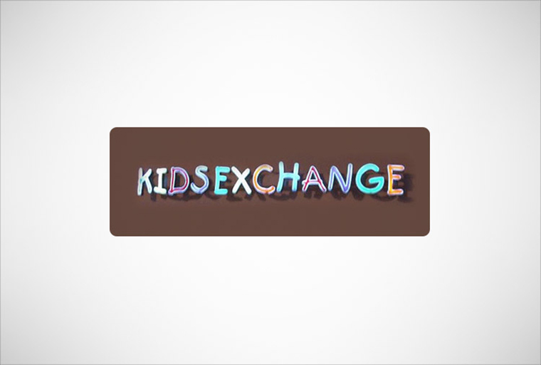
Kids Exchange
A little bit of letter spacing and punctuation can sometimes save the day.
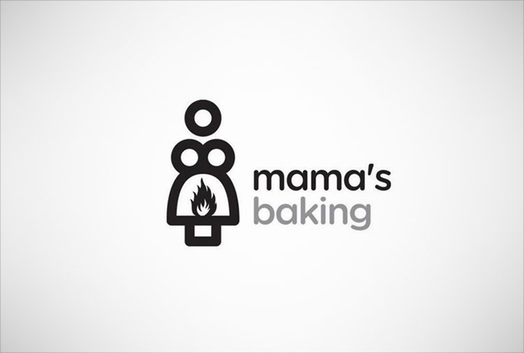
Mama’s Baking
What have you really got cooking in there Mama?
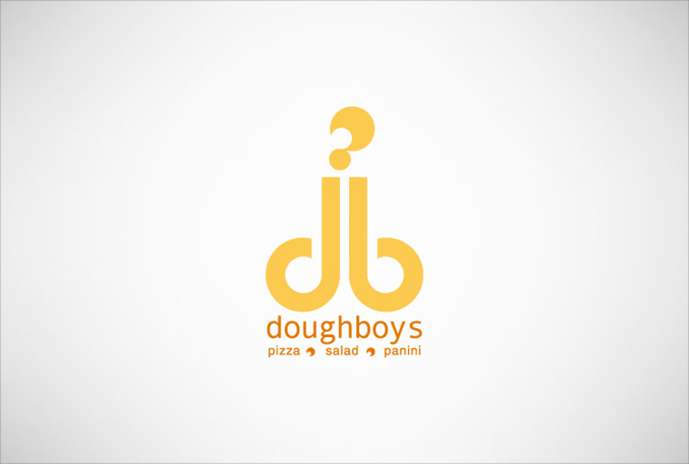
Dougboys
Friends of Dick Clark Productions maybe?
Junior Jazz
Just squint a little, you’ll see it. Negative space for a not so positive result!
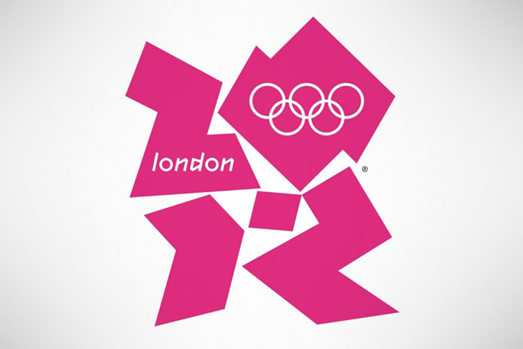
Olympic Logo of London 2012
When London unveiled its £400,000 2012 logo design, the masses were unimpressed. Designed by Wolff Olins at an expenditure of £400,000 (almost $800,000) the logo has been met with expected ambivalence, and, in some unavoidable cases, hatred.
Some claimed that it looks like Lisa Simpson in action, others expressed a view that the logo resembles a swastika. On the flip-side, Iran had threatened to boycott the Olympics since they believe that the logo spells out ‘Zion.’ Pick your poison, but the logo seems to be a resounding fail.
Moral to this story… if you are about to embark on a rebranding journey, do it once, do it properly. Before someone in the organisation gets too far with crayons or photoshop, have NRG Advertising come in and go through the process with your team in a well orchestrated, structured process. To ensure you receive some ‘logo envy’ in the future, simply drop us a line here or give us a call on (08) 8232 8188, it will guarantee you won’t be appearing in our next round of logo fails!
Liked our eSight? Why not ‘like us’ on facebook!
Back
